eNPS Sentiment Analysis
We’re excited to announce that we’ve added sentiment analysis to your eNPS surveys. Now you’ll be able to understand truly what your employees are saying in their comments. With sentiment analysis you’ll be better informed about topics your employees are concerned about, report back to senior leadership about trends you’re seeing, and make changes in your organization that will impact the culture of your organization and the happiness of your employees.
Now when your employees leave a response in their eNPS survey you can assign positive or negative sentiment to it. Your Promoters had valuable feedback on ways the company could continue to improve and Detractors could still see some of the great things companies were doing. Assigning the right sentiment to each tagged response is critical to helping your organization make the right decisions for the future.
This powerful new way of assigning sentiment impacts Employee Satisfaction with eNPS in four specific areas.
Update #1
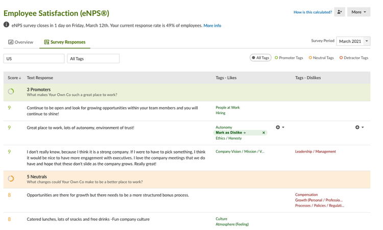
In the Survey Responses tab, the tags are now sorted in two columns: Likes and Dislikes. When an employee gives a 9 or 10 (a Promoter) the tags associated with their response will default to the Like column. While reviewing their response if you notice the comment is about something they would like to see improved you can easily move it over to the Dislikes column. This also works with Neutrals (employees who give a 7 or 8) and Detractors (employees who give a 0-6) but their tags will default in the Dislikes column.
Update #2
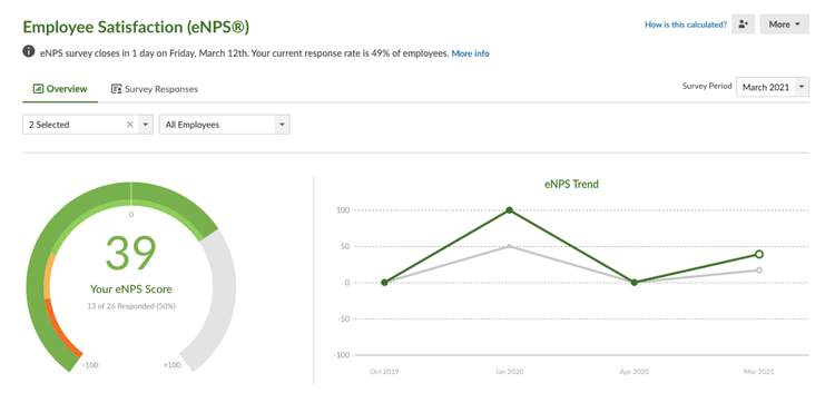
When you’re in the Overview tab you’ll notice that when you apply filters the eNPS chart will change. You’ll also notice that there’s a ghost line so you can see how these filters compare against the company.
Update #3
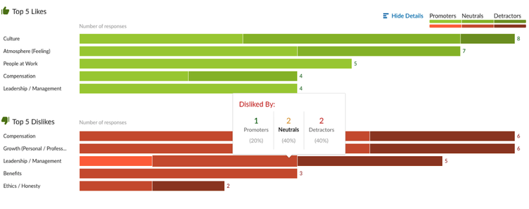
The Top 5 Likes chart now shows you the total number of positive mentions for a topic. In the top right corner you can click on “show details”. This will show you how many Promoters, Neutrals, and Detractors marked this topic as a like in their responses. You can also see this breakdown by hovering over the bar.
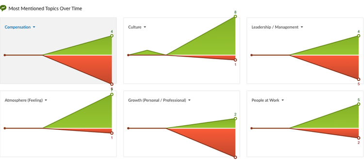
Update #4
We’ve added a new section with charts of the most mentioned topics over time. This section automatically populates the most commonly mentioned topics from all of your eNPS surveys and plots them out over time. This new section can help you see if a topic is a consistent theme over several survey periods or if it’s an anomaly.