A Human Design for Human Resources
Behind the Scenes of BambooHR's New Design
Something’s different.
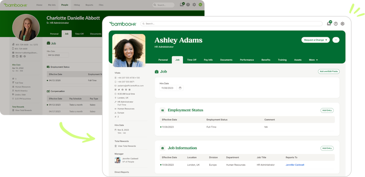
That thought has popped into the minds of many BambooHR customers as they’ve recently gone into the platform and discovered a freshly re-designed interface. Corners are rounded, fonts are switched, and the navigation bar has migrated.
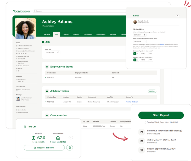
The latest design update for BambooHR introduces a clean, modern look that also radiates warmth. It’s friendly, self-assured, and, most importantly, human. In short, it’s a visual declaration of what it means to use BambooHR.
Steve Ballard, director of BambooHR product design, and Tony Fonseca, principal product designer, share the recent changes in the interface, the complex relationship between brand and product, and how the new design came to life.
About the Experts

Steve Ballard
Director of Product Design
Steve Ballard leads a talented team of product designers at BambooHR who are passionate about creating delightful HR software that people actually love to use. Over the past 25 years, Steve has led product design for popular consumer and B2B software companies. He is driven by the challenge of solving complex customer problems in ways that are simple to understand, beautifully designed, and easy to use.
Tony Fonseca
Principal Product Designer
Tony Fonseca is a Principal Product Designer at BambooHR, where he has spearheaded a variety of product design initiatives over his 10-year tenure. Driven by a passion for interaction and visual design, he excels at turning complex challenges into intuitive, thoughtful user experiences.

Time for a Change
It’s been five years since the last major design update to BambooHR, and the platform has seen a lot of exciting technical developments during that time. The product design team was eager to create an interface that reflected the BambooHR of today.
Steve says the team’s inspiration began with the customer. “We thought about our admins and all their employees who use BambooHR, and we wanted to create a more familiar, modern-looking user interface that’s comparable to the different things they’re using now,” he says.
The design update is also motivated by a desire to align the platform with how the BambooHR brand identity has evolved. “Marketing can refresh the brand look more frequently than product design is able to,” shares Steve, so a user interface (UI) design update was an exciting opportunity for creative collaboration. “It was a really cool, collaborative effort to work closely with brand marketing. We were meeting regularly and making decisions together on iconography, fonts, and color palettes. I think when somebody comes from the website into the product, there’s now a very strong connection.”
A Mature, Friendly Interface
“The best interface is one that people don’t notice at all.”
Tony Fonseca | Principal Product Designer
Steve and Tony wanted a design that “got out of the way” and offered a clean, intuitive interface for users. Still, it wouldn’t be BambooHR without a bit of personality.
The new interface is designed to make users feel secure—it’s warm, but it also maintains a trustworthy, professional feel. Tony describes the ideal as a nuanced balance between friendliness and maturity, “not stodgy, but not something I’d feel uncomfortable putting my Social Security number into.”
The key was adding a human touch. “Our customers tend to love that the BambooHR brand is very friendly and human, and the design reinforces that,” says Steve. The design team needed to craft font options, icon design, color palette, and microcopy that gave users the sense that there’s a trustworthy person behind the platform.

Finding the Look
How do you make a software design feel human? For the BambooHR designers, it took experimentation. The design team developed dozens of iterations and put them through user preference testing, assessing for qualities like modern design and friendly feel.
“It’s tricky, because it’s very subjective,” says Tony. Some design elements emerged as a shared preference among users, such as the rounded corners and buttons. Other features were more controversial, like the amount of negative space. “This design, by its nature, is more airy and spacey,” he describes, “which has the effect of feeling more approachable and friendly. But for super data-oriented users, they just want content on the screen, they don’t want a lot of empty space.”
Determining the final design involved a process of elimination. Product design identified which elements of each design were working best, combined the elements into new designs, and tested them again, narrowing down options until they arrived at the final version of the new interface. In the end, to tap into that ephemeral quality that makes a design feel human, they relied on their own human instincts. “We leaned on our own expertise and desires for the personality of the platform.”

Small Words, Big Personality
A platform’s personality can reside in the smallest of design elements, like microcopy. Microcopy is all the words and short phrases that appear on the interface—from basic button labels to more playful quips. At BambooHR, each word is chosen carefully. Working closely with brand marketing, the product design team uses a microcopy style guide to define precisely how the BambooHR voice should come through on the platform.
“We don’t want to sound like a robot, like a lot of software does—that’s not us,” Steve explains. “We try to walk the line of being friendly, a little colloquial, but not too unserious.” For Tony, finding that balance requires taking some creative risks. “It’s hard, but I’d rather err on the side of being friendly, and have to pull back a little, than just play it safe all the time.”
A Futureproof Navigation Bar
A noticeable change is the navigation bar, which has been moved to the left side of the screen. Tony explained that good UI design comes in part from understanding the user’s intuition.
“People expect software to work in ways they’ve come to expect from using other software,” he says. Left-hand navigation bars have become increasingly common on the modern web, so it made sense to adapt it. Steve noted that the vertical design and focus on iconography aligns better with day-to-day use of the platform: “You can still expand it to show the labels, but once somebody is familiar with their nav bar, it makes it a more minimalistic, less cluttered experience.”
According to Tony, the new subnavigation design also has a lot of practical benefits from a design perspective since it takes up less vertical space, which is precious real estate for a computer screen. Opening up that space gives the interface a cleaner look and gives the product design team more room to work with as the platform grows in the future.
Connecting Through Typography
Fonts are a major design decision for any product, and that choice carries even more weight for BambooHR because of the platform’s custom color options. Color customization is a great way for users to cultivate their own brand identity among employees, but it presents a challenge to product design by limiting the number of visual strategies for incorporating the BambooHR brand.
“One of the initial objectives of the redesign is to better align our brand marketing and product,” shares Tony. “A good headline font is a great way to achieve that. We ended up deciding on Fields. Fields is friendly—it feels warm, it feels inviting, but it also doesn’t feel childish.”
Fields, created by type designer Adam Ladd, is certainly a strong visual embodiment of BambooHR. It’s a thick, sturdy style that offers all the softness of curved lines within the professional silhouette of a classic serif font. Adam describes, “Details like rounded serifs, teardrop terminals, and subtle tails make it friendly and approachable, while a large x-height with flat-topped serifs gives it an air of confidence and stability.”
Fields has a slight retro aesthetic, and it leans more into artistic sensibilities than some of the hyper-practical fonts of other software, but it doesn’t come off as indulgent. Instead, Fields feels generative—it’s an invitation for users to think creatively and look towards the future.
“The headline font is an important opportunity to connect BambooHR to our brand,” explains Steve, “Fields is really distinctive and we use it all over our marketing, so it helps make the connection to the BambooHR brand while still letting customers make the platform their own.”

Creating Unified Iconography
Product design also gave an update to the iconography, unifying the design style under one font source. As UI design trends continue to favor a minimalist approach, icons serve a significant role, acting as a navigational shorthand for users and in some cases replacing written language altogether.
Bringing all the iconography into a single font family not only serves a practical purpose for the designers at BambooHR (hand-making icons is more a labor of time than love), but it also creates a more cohesive visual language for the platform, allowing for an easier, more seamless experience.
“It ensures consistency in style and presentation,” says Tony. “Our new icon font is clean and modern and gets out of the way. It doesn’t distract and it doesn’t pull attention to itself.” Each icon, he explains, can “feel like it’s part of the same platform, and feel related to other icons throughout the product.”

Making HR Feel Cool
BambooHR isn’t just a software people casually play with—it’s a platform for important (and often stressful) work functions, like running payroll, conducting performance reviews, or managing benefits. It’s a reality that Tony and Steve take to heart.
For the BambooHR design team, bringing some beauty into the world of HR has a serious purpose. “It’s super fulfilling to know that we’re able to impact so many people and their everyday lives,” shares Tony, “and it’s a very heavy mantle of responsibility to not mess it up.”
Not only can good design help humanize the work experience, but it can also highlight the important contributions HR makes to an organization. “I really do think we can make HR cool,” says Steve. “When they bring in a modern, aesthetically pleasing software that feels human and employees actually enjoy using, HR becomes a hero.”